
Brand Resources
Welcome to the hub of Hashout’s Brand Resources
— Your one-stop-place for all-things brand.
Need anything that's not here?

Write to letstalk@become.team
Downloads
One stop place to download logos, photos,
fonts, and more.
Logos


.svg)
Fonts
Let developers and designers download source files in no time.
Satoshi
ZIPSometype Mono
Google FontsGuidelines
Typography
Our design system helps us work together to build a great experience for all of your communication touchpoints. Setting a global typography for the brand helps in scalability and consistency.
Brand Fonts
1. Satoshi
Satoshi is a geometric sans serif font that combines modern aesthetics with functional clarity. It offers a balanced design that feels clean, minimal, and versatile across digital and print applications. The font maintains a contemporary character without being visually heavy, making it approachable and reader-friendly for a wide range of uses
2. Sometype Mono
Sometype Mono is a contemporary monospaced font that balances structure with readability. Its geometric design feels modern and precise while maintaining clarity across both digital and print spaces. The font’s clean rhythm and consistent spacing make it highly functional without appearing rigid, ensuring it remains approachable and visually comfortable for extended reading.
Size Guideline
Become provides a constrained set of typographic styles. These styles map as much as possible to functional roles so you know when each can be used. Don’t use units for line-heights. Keep it unitless
Title Heading Styles

H1 / 64PX / 1.3 EM
H2 / 48PX / 1.3 EM
H3 / 38PX / 1.3 EM
H4 / 30PX / 1.3 EM
Paragraph Text Styles


P4/ 16PX / 1.8 EM
Application

Color
There's nothing better than using a global color scheme across the brand. The color scheme leverage brand recognition and marks our vibrant presence.
Primary Colors
Our primary palette features White as the foundation, ensuring clarity and balance across all applications. The Poly gradient is a distinctive brand element, used selectively to add vibrancy and depth, creating a dynamic contrast with the core color.
Dark Void
HEX: #161616
RGB: 22, 22, 22
Pantone: Black 6 C
HEX: #161616
RGB: 22, 22, 22
Pantone: Black 6 C
White
HEX: #FFFFFF
RGB: 255, 145, 115
Pantone : 7499 C
HEX: #FFFFFF
RGB: 255, 145, 115
Pantone : 7499 C
Accent Colours
Our accent colour palette contains a variety of colours to keep things fresh and interesting. We lean on these colours more frequently when brand awareness is high, or in own properties where we control the surrounding environment.
Fiery Glow
HEX: #F0481D
RGB: 240, 72, 29
Pantone: 2347 C
HEX: #F0481D
RGB: 240, 72, 29
Pantone: 2347 C
HEX: #A83214 | RGB: 168, 50, 20
HEX: #F47F61 | RGB: 244, 127, 97
Legendary Lavender
HEX: #9F54E3
RGB: 159, 84, 227
HEX: #9F54E3
RGB: 159, 84, 227
HEX: #6F3B9F | RGB: 111, 59, 159
HEX: #BC87EB | RGB: 188, 135, 235
Electric Eel
HEX: #92B9F6
RGB: 146, 185, 246
HEX: #92B9F6
RGB: 146, 185, 246
HEX: #4D87E2| RGB: 77, 135, 226
HEX: #B3CEF9 | RGB: 207, 225, 255
Cotton Boll
HEX: #E2EDFF
RGB: 226, 237, 255
HEX: #E2EDFF
RGB: 226, 237, 255
Gradients
Poly Gradient
Fiery Glow (#F0481D)
Legendary Lavender (#9F54E3)
Electric Eel (#92B9F6)
Cotton Boll (#E2EDFF)
Fiery Glow (#F0481D)
Legendary Lavender (#9F54E3)
Electric Eel (#92B9F6)
Cotton Boll (#E2EDFF)
Poly Gradient
Electric Eel (#92B9F6)
Cotton Boll (#E2EDFF)
Electric Eel (#92B9F6)
Cotton Boll (#E2EDFF)
Poly Gradient
White(#92B9F6)
Cotton Boll (#E2EDFF)
White(#92B9F6)
Cotton Boll (#E2EDFF)
Logo Usage
Exclusion Zone
When placing the formal logo, be sure that other text and graphic elements do not encroach on it. When visual elements are placed too close to the logo, it can lead to a congested unpleasant appeal and also might create confusion.In order to let the logo breathe, it should be surrounded with clear space to ensure its visibility and impact.
The height of the ‘O in Hashout should be respected as the minimum distance from all sides of the logo to any other objects or margins in the composition.
The height of the ‘O in Hashout should be respected as the minimum distance from all sides of the logo to any other objects or margins in the composition.
.svg)
Proper Application of Logo: DOs

Always use the Hashout light logo on dark Imagery/ darker parts of the Imagery to maintain thecontrast level

Always use the Hashout Dark logo on light imagery/ lighter parts of the Imagery to maintain thecontrast level
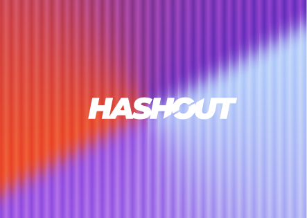
Always use the correct logo+background pairing to maintain the contrast level.
.jpg)
Always maintain a minimum area of the exclusion zone around the logo to maintain design hygiene and legibility.
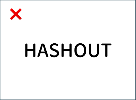
Logo Misuse: DON’Ts

Do not keep a low contrast between the image and thecolor of the logo.
.png)
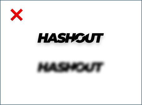
Do not stretch, squeeze, rotate or distort any part of the logo.Always scale uniformly.
Do not change the typeface within the wordmark.

Do not change the colors of the logo randomly.
Do not change the colors of the logo randomly.
Text Usage: DOs

Always follow the right pairing of fonts and sizes, to be mindful of legibility
.svg)
Use only light coloured backgrounds for applications that are text heavy
Text Usage: DON’Ts

Do not overlap text with the exclusion zone of logo. Do not use darker backgrounds with text heavy applications.

Prioritize colour contrast of the text based on the importance it has on the application. Do not use too many text colours on the same application.