
Brand Resources
One stop shop to download logos, photos, fonts, and more. Need anything that's not here? Write to hello@become.team
Brand Logo Concept Note:
A Mark of Timeless Brilliance
The logo is a refined expression of elegance and intention which evokes heritage and craftsmanship, while the sculpted curves and distinctive accents introduce a sense of individuality and modern grace. The balance between strength and delicacy in everyday fine jewellery which is bold in presence, yet intricate in detail.
Every element in language is designed to feel enduring radiance. The elevated accent and subtle detailing act like a signature flourish, symbolising brilliance and distinction. Together, the typography and spacing create a mark that is poised, confident, and timeless in a visual identity that reflects commitment to craftsmanship, authenticity, and lasting beauty in jewellery experience.
Every element in language is designed to feel enduring radiance. The elevated accent and subtle detailing act like a signature flourish, symbolising brilliance and distinction. Together, the typography and spacing create a mark that is poised, confident, and timeless in a visual identity that reflects commitment to craftsmanship, authenticity, and lasting beauty in jewellery experience.
Primary Logotype
%20Meghante.svg)
%20Meghante%20(2).svg)

%20Meghante.svg)
Transparent Logo
%20Meghante%20(1).svg)
%20Meghante%20(2).svg)
%20(2).svg)
%20(1).svg)
%20(1).svg)
%20(2).svg)
Transparent Logo
%20(1).svg)
%20(2).svg)
.svg)
.svg)
.svg)
Typography
Our design system helps us work together to build a great experience for all of your communication touchpoints. Setting a global typography for the brand helps in scalability and consistency.
Brand Fonts
1. PP Cirka
It is a refined serif typeface known for blending classical elegance with contemporary sharpness. High-contrast strokes, graceful serifs, and balanced spacing create a sense of heritage and exclusivity. The typography style that communicates timelessness, sophistication, and quiet confidence which are the qualities essential to premium jewellery.
2. Source Serif 4
Combines classical serif foundations with contemporary clarity, making it a strong choice for luxury jewellery branding. Its balanced proportions, refined stroke contrast, and elegantly shaped serifs create a sense of heritage and sophistication without feeling overly ornate. The typeface carries a quiet authority and readability that feels trustworthy and communicating craftsmanship enduring elegance.
3. Sofia Pro
Sofia Pro brings a modern, refined simplicity that works beautifully in luxury jewellery branding. Its clean geometric structure, smooth curves, and balanced spacing create a polished and contemporary feel without overpowering elegance. It communicates modern luxury, clarity, and confident restraint.
Size Guideline
Become provides a constrained set of typographic styles. These styles map as much as possible to functional roles so you know when each can be used. Don’t use units for line-heights. Keep it unitless
Title Heading Styles

H1 / 64PX / 1.3 EM

H2 / 48PX / 1.3 EM

H3 / 38PX / 1.3 EM

H4 / 30PX / 1.3 EM
Subheading and Paragraph Text Styles

P1/ 30PX / 1.8 EM

P2/ 24PX / 1.8 EM

P3/ 18PX / 1.8 EM

P4/ 16PX / 1.8 EM
Application

Colors
There's nothing better than using a global color scheme across the brand. The color scheme leverage brand recognition and marks our vibrant presence.
Primary Colors
Our primary brand colour is Cerulean blue, factoring 50% in terms of usage in application offering consistency and recognisability. When paired with accents like gold, it enhances the perception of premium value, allowing the brand to feel both contemporary and timeless.
Cerulean blue
HEX: #0C78AARGB: 12, 120, 170
Pantone : 7690 C
HEX: #0C78AARGB: 12, 120, 170
Pantone : 7690 C
Secondary Colors
The secondary palette consists of two foundational colours representing for dark and light version background usage and also gradients
Luxe silk
HEX: #FFECC9
RGB: 255, 236, 201
Pantone: 7499 C
HEX: #FFECC9
RGB: 255, 236, 201
Pantone: 7499 C
Midnight slate
HEX: #2B3F48
RGB: 43, 63, 72
Pantone : 432 C
HEX: #2B3F48
RGB: 43, 63, 72
Pantone : 432 C
Gilded dawn
(Gradient)
(Gradient)
HEX: #0C78AA | RGB: 12, 120, 170
HEX: #CBE8FD | RGB: 203, 232, 253
HEX: #FFECC9 | RGB: 255, 236, 201
Quiet radiance
(Gradient)
(Gradient)
HEX: #E7C88E | RGB: 231, 200, 142
HEX: #FFECC9 | RGB: 255, 236, 201
Neutral & Accent Colours
Our Neutral colour palette contains a variety of colours to keep colours in contrast. We lean on these colours in properties where we control the environment usecases.
Carbon Fiber
HEX: #262626
RGB: 38, 38, 38
HEX: #262626
RGB: 38, 38, 38
Anti flash white
HEX: #F3F3F3
RGB: 243, 243, 243
HEX: #F3F3F3
RGB: 243, 243, 243
Rich pastel blue
HEX: #9FD1E8
RGB: 159, 209, 232
HEX: #9FD1E8
RGB: 159, 209, 232
Andrea
HEX: #CBE8FD
RGB: 203, 232, 253
HEX: #CBE8FD
RGB: 203, 232, 253
Mandalay
HEX: #AF7915
RGB: 175, 121, 21
HEX: #AF7915
RGB: 175, 121, 21
Logo Usage
There's nothing better than using a global color scheme across the brand. The color scheme leverage brand recognition and marks our vibrant presence.
Exclusion Zone
When placing the formal logo, be sure that other text and graphic elements do not encroach on it. When visual elements are placed too close to the logo, it can lead to a congested unpleasant appeal and also might create confusion. In order to let the logo breathe, it should be surrounded with clear space to ensure its visibility and impact.
The three-quarters height of Meghanté ‘ME’ should be respected as the minimum distance from all sides of the logo to any other objects or margins in the composition.
The three-quarters height of Meghanté ‘ME’ should be respected as the minimum distance from all sides of the logo to any other objects or margins in the composition.
Proper Application of Logo: DOs
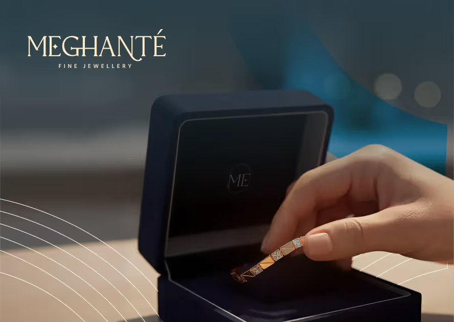
Always use the Mumfy light logo on dark Imagery/ darker parts of the Imagery to maintain thecontrast level
.avif)
Always use the 4 Ounces Dark logo on light imagery/ lighter parts of the Imagery to maintain the contrast level
.avif)
Always use the correct logo + background pairing to maintain the contrast level.
.avif)
Always maintain a minimum area of the exclusion zone around the logo to maintain design hygiene and legibility.
Logo Misuse: DON’Ts
Some of the examples of most likely misuses of identity are shown below. It’s imperative that the brand identity is consistent across all touchpoints at all times. To avoid these, always use the provided identity from here without any modification.
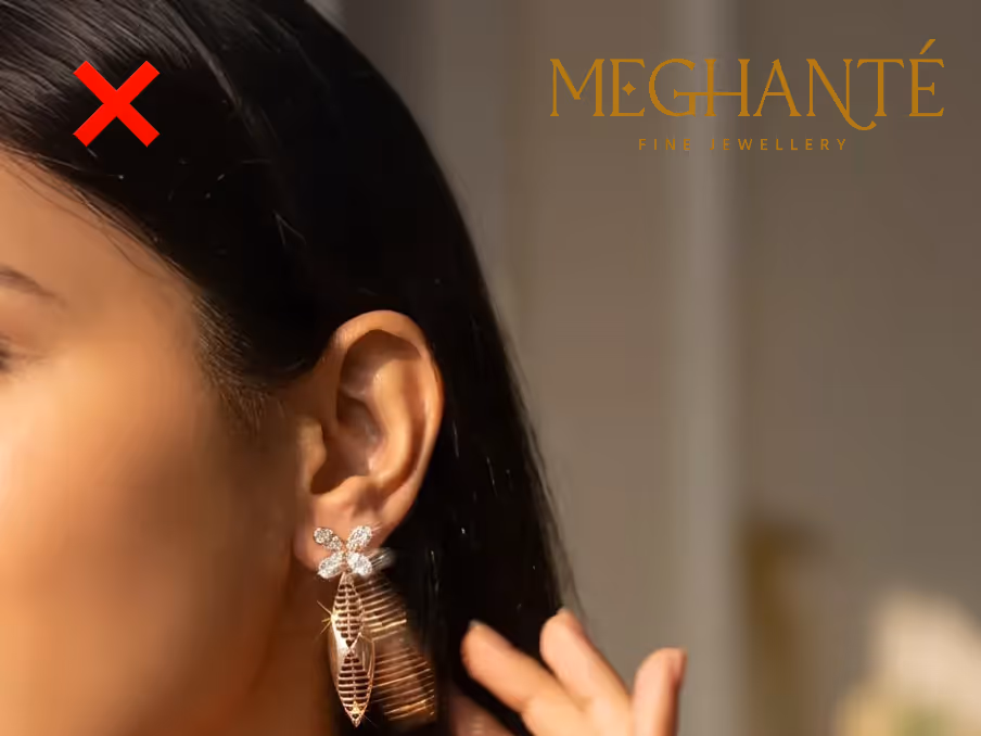
Do not keep a low contrast between the image and thecolor of the logo.
.avif)
Do not stretch, squeeze, rotate or distort any part of the logo.Always scale uniformly.
.avif)
Do not change the typeface within the wordmark.
.avif)
Do not change the colors of the logo randomly
.avif)
Do not add any effects to the logo.
.avif)
Do not alter the components of the logo
Text Usage: DOs
.avif)
Always follow the right pairing of fonts and sizes, to be mindful of legibility
.avif)
Use only light coloured backgrounds for applications that are text heavy
Text Usage: DON’Ts
.avif)
Do not overlap text with the exclusion zone of logo. Do not use darker backgrounds with text heavy applications.
.avif)
Prioritize colour contrast of the text based on the importance it has on the application. Do not use too many text colours on the same application.