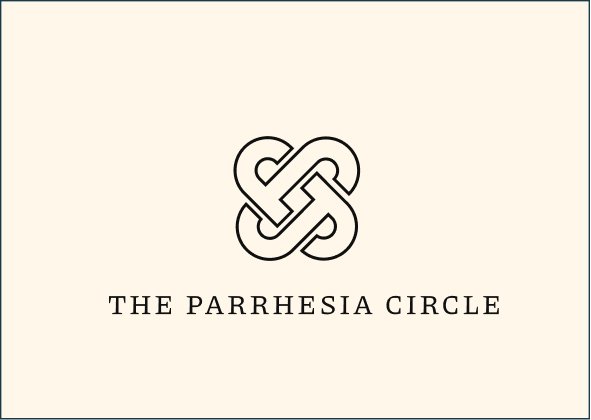
Brand Resources

One stop shop to download logos, photos, fonts, and more.

Need anything that's not here?

Downloads

Fonts

Let developers and designers download source files in no time.
Piazzolla
Google Fonts
Courier Prime
Google Fonts

Guidelines

Our design system helps us work together to build a great experience for all of Webflow’s users and employees.

Typography

Our design system helps us work together to build a great experience for all of your communication touchpoints. Setting a global typography for the brand helps in scalability and consistency.

Brand Fonts

1. Piazzolla

2. Courier Prime


Size Guideline

Become provides a constrained set of typographic styles. These styles map as much as possible to functional roles so you know when each can be used. Don’t use units for line-heights. Keep it unitless


Title Heading Styles

H1 / 64PX / 1.3 EM
H2 / 48PX / 1.3 EM
H3 / 38PX / 1.3 EM
H4 / 30PX / 1.3 EM

Paragraphs

Big Paragraph/ 20PX / 1.8 EM

Applications

Color

There's nothing better than using a global color scheme across the brand. The color scheme leverage brand recognition and marks our vibrant presence.

Primary Colors

Our primary color palette consists of two values, creating a sense of duality in every collateral. Rich Black and Soft Vanilla, are two of the brand’s iconic primary colours factoring 50% in terms of application further restablishing the sense of balance.
Rich Black
HEX: #101010
RGB: 16, 16, 16
Pantone : 419 C
Soft Vanilla
HEX: #FFF7E9
RGB: 255, 247, 233
Pantone : 468 C

Secondary Colors

Our secondary palette contains a variety of colors to keep things fresh and interesting. We lean on these colors more frequently when brand awareness is high, or on our own properties where we control the surrounding environment. And owing to the dynamic nature of our brand and the different players the brand interacts with, the following colors are presented to strengthen the brand.
Deep Scarlet
HEX: #B61F24
RGB: 182, 31, 36
Pantone: 1805 C

Logo Usage

There's nothing better than using a global color scheme across the brand. The color scheme leverage brand recognition and marks our vibrant presence.

Exclusion Zone

When placing the formal logo, be sure that other text and graphic elements do not encroach on it. When visual elements are placed too close to the logo, it can lead to a congested unpleasant appeal and also might create confusion. In order to let the logo breathe, it should be surrounded with clear space to ensure its visibility and impact.

For the Vertical Logo, The marigin for the typeface is equal to the monogram on both the sides. The space between the monogram and the text is equal to that of two ‘X’ in the same size that of the typeface below.

Proper Application of Logo: DOs

Some of the examples of most likely misuses of identity are shown below. It’s imperative that the brand identity is consistent across all touchpoints at all times. To avoid these, always use the provided identity from here without any modification.
Always use the TPC light logo on dark Imagery/ darker parts of the Imagery to maintain thecontrast level
Always use the TPC Dark logo on light imagery/ lighter parts of the Imagery to maintain thecontrast level
Always use the correct logo+background pairing to maintain the contrast level.
Always maintain a minimum area of the exclusion zone around the logo to maintain design hygiene and legibility.

Logo Misuse: DON’Ts

Some of the examples of most likely misuses of identity are shown below. It’s imperative that the brand identity is consistent across all touchpoints at all times. To avoid these, always use the provided identity from here without any modification.
Do not keep a low contrast between the image and thecolor of the logo.
Do not stretch, squeeze, rotate or distort any part of the logo.Always scale uniformly.
Do not change the typeface within the wordmark.
Do not change the colors of the logo randomly
Do not add any effects to the logo.

Text Usage: DOs

Always follow the right pairing of fonts and sizes, to be mindful of legibility
Use only light coloured backgrounds for applications that are text heavy

Text Usage: DON’Ts

Do not overlap text with the exclusion zone of logo. Do not use darker backgrounds with text heavy applications.
Prioritize colour contrast of the text based on the importance it has on the application. Do not use too many text colours on the same application.