.svg)
Brand Resources
One stop shop to download logos, photos, fonts, and more. Need anything that's not here? Write to hello@become.team
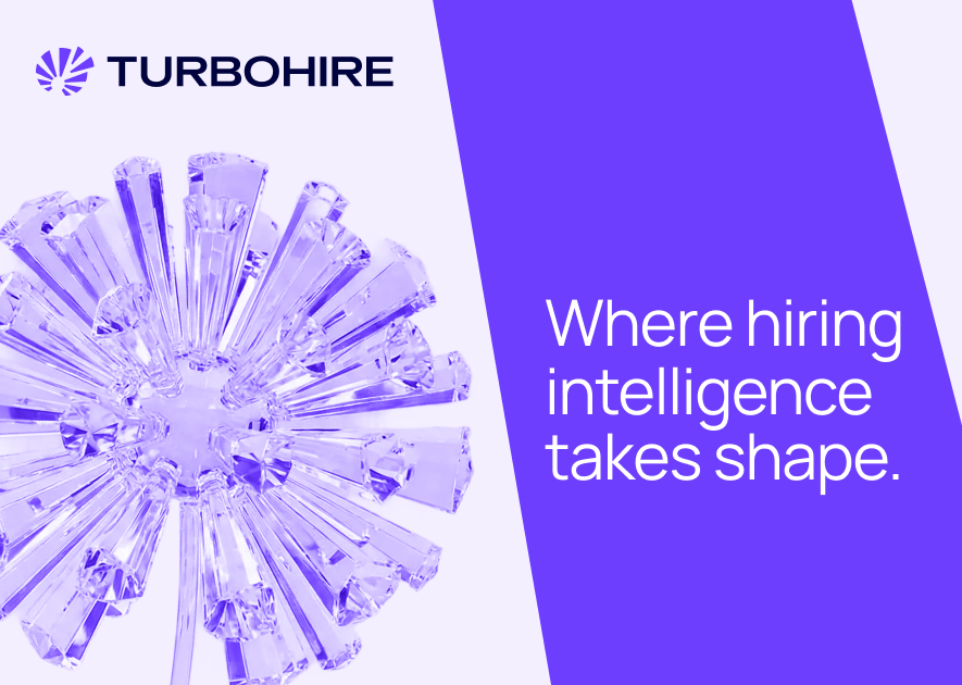
Brand Logo Concept Note:
Orchestrating Momentum. Releasing Potential.
The TurboHire identity draws inspiration from the dandelion, nature’s symbol of resilient dispersion and intentional spread. It reflects a hiring ecosystem where roles evolve, volumes fluctuate, and stakeholders shift yet the system remains stable, adaptive, and built to persist under disruption.
The beyond blue monogram anchors this motion with authority and technological confidence. The color speaks to depth, intelligence, and future-focus, while the expanding emblem conveys scalability and potential at scale. TurboHire is not just a tool, but a coordinated engine that transforms complexity into forward movement, turning every release into measurable growth.
The beyond blue monogram anchors this motion with authority and technological confidence. The color speaks to depth, intelligence, and future-focus, while the expanding emblem conveys scalability and potential at scale. TurboHire is not just a tool, but a coordinated engine that transforms complexity into forward movement, turning every release into measurable growth.
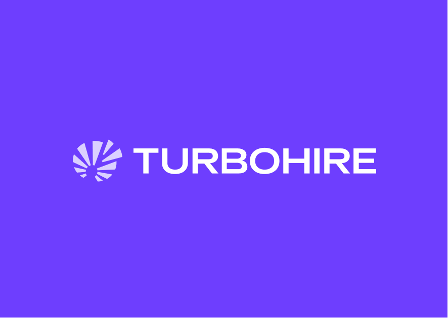
Primary Logotype
.svg)
.svg)
.svg)
.svg)
Transparent Logo
.svg)
.svg)
.svg)
.svg)
.svg)
.svg)
.svg)
.svg)
.svg)
Transparent Logo
.svg)
.svg)
.svg)
.svg)
Primary Monogram
.svg)
.svg)
Dark Background
.svg)
.svg)
.svg)
Transparent Logo
.svg)
-1.svg)
-1.svg)
-1.svg)
.svg)
.svg)


Typography
Our design system helps us work together to build a great experience for all of your communication touchpoints. Setting a global typography for the brand helps in scalability and consistency.
Brand Fonts
1. Manrope
Manrope provides a seamless blend of modern geometric precision and humanist warmth. Its semi-condensed structure and clean, minimal lines make it exceptionally versatile, allowing it to function as a high-impact headline font while remaining highly legible for long-form body text. The technical reliability helps establish brand consistency and trust that prioritizes clarity and user experience.
2. Paralucent
Paralucent offers a warm and versatile all-purpose modern sans-serif aesthetic that balances technical precision with high-impact personality. This super-family is built on geometric principles which provides a distinct, contemporary edge that sets a brand apart enabling designers to transition seamlessly from bold, authoritative headlines to intricate, readable body text.
3. Archivo
Archivo is the secondary body typeface which is a google font suitable for google workspace, it is a grotesque sans serif typeface family originally designed for highlights and headlines. The technical and aesthetic characteristics of the font are both crafted for high performance typography. It was designed to be used simultaneously in print and online platforms and supports over 200 world languages.
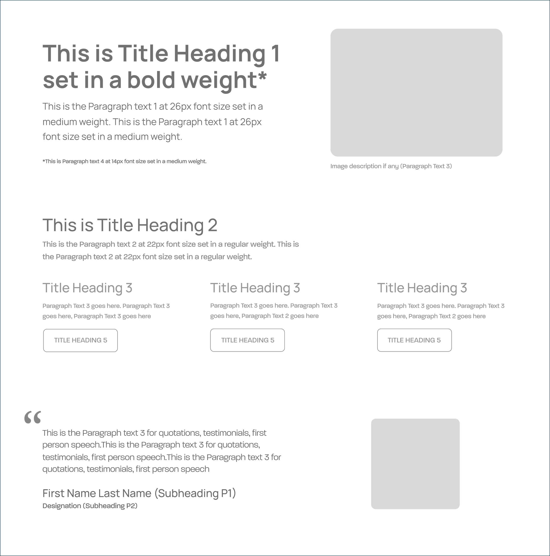
Size Guideline
Become provides a constrained set of typographic styles. These styles map as much as possible to functional roles so you know when each can be used. Don’t use units for line-heights. Keep it unitless
Title Heading Styles

H1 / 64PX / 1.3 EM

H2 / 48PX / 1.3 EM

H3 / 38PX / 1.3 EM

H4 / 30PX / 1.3 EM
Subheading and Paragraph Text Styles

P1/ 30PX / 1.8 EM

P2/ 24PX / 1.8 EM

P3/ 18PX / 1.8 EM

P4/ 16PX / 1.8 EM
Application
Colors
There's nothing better than using a global color scheme across the brand. The color scheme leverage brand recognition and marks our vibrant presence.
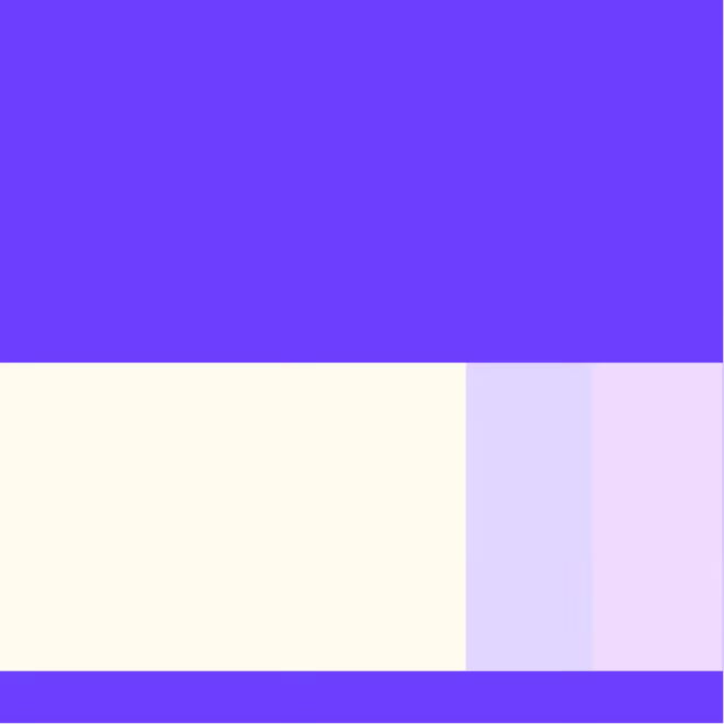
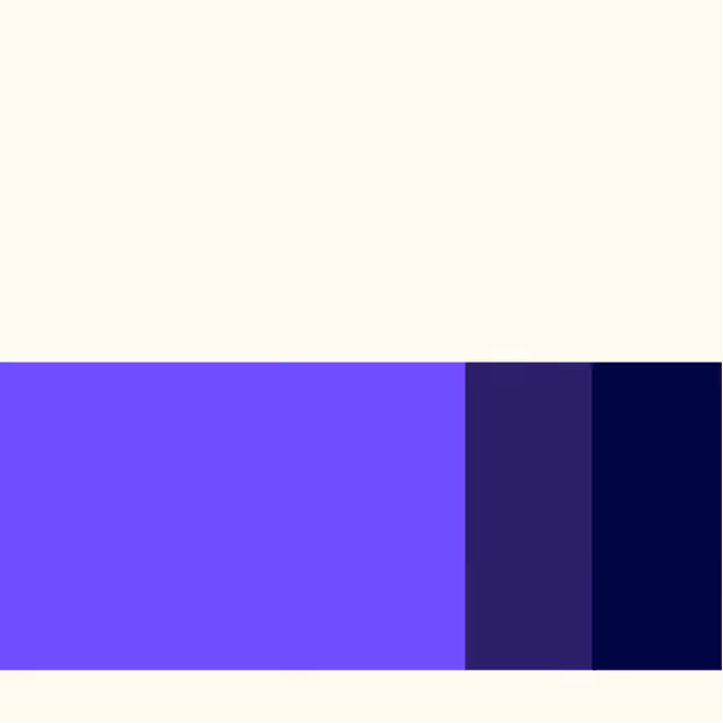
Primary Colors
Our primary color palette consists of main primary along with it’s tint and tone variation. Beyond Blue colour is the brand’s iconic primary colour factoring 50% in terms of application with it’s colour variations. Usage the tint and tone should be done sparingly as the environment and when required to stand out in comparison to the parent colors.
Beyond Blue
HEX: #6E3EFE
RGB: 110, 62, 254
Pantone : 2665 C (Dist. 61)
HEX: #6E3EFE
RGB: 110, 62, 254
Pantone : 2665 C (Dist. 61)
HEX: #F0EAFF | RGB: 240, 234, 255
HEX: #2C1966 | RGB: 44, 25, 102
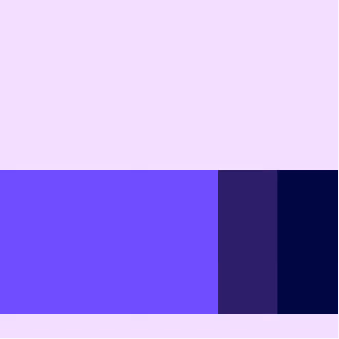
Secondary Colors
The secondary palette consists of three foundational colours representing dark, light and a tone variant of colour that accommodates and goes along with the primary colours
Clear Violet
HEX: #E3BDFF
RGB: 227, 189, 255
Pantone : 531 C (Dist. 27)
HEX: #E3BDFF
RGB: 227, 189, 255
Pantone : 531 C (Dist. 27)
HEX: #F0DBFF | RGB: 240, 219, 255
HEX: #887199 | RGB: 136, 113, 153
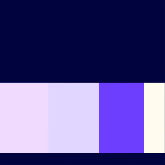
Seedspace
HEX: #01033E
RGB: 1, 3, 62
Pantone : 282 C(Dist. 27)
HEX: #01033E
RGB: 1, 3, 62
Pantone : 282 C(Dist. 27)
Pollen Veil
HEX: #FFFBEE
RGB: 255, 251, 238
Pantone : 7436 C(Dist. 37)
HEX: #FFFBEE
RGB: 255, 251, 238
Pantone : 7436 C(Dist. 37)
Neutral & Accent Colours
We have a single accent colour to keep things fresh and interesting. We lean on these colour more frequently when brand awareness is high, or in own properties where we control the surrounding environment.
Talent Spark
HEX: #FFD166
RGB: 255, 209, 102
HEX: #FFD166
RGB: 255, 209, 102
Preferred Colour schemes and proportions
The combinations of various Background colors and the potential foreground colors usage that gives good contrast in applications
Preferred Gradient Options
Neural Rise
(Gradient 1)
(Gradient 1)
HEX: #F0EAFF | RGB: 240, 234, 255
HEX: #6E3EFE | RGB: 110, 62, 254
Ascent Calm
(Gradient 2)
(Gradient 2)
HEX: #6E3EFE | RGB: 110, 62, 254
HEX: #E3BDFF | RGB: 227, 189, 255
Core Immersion
(Gradient 3)
(Gradient 3)
HEX: #6E3EFE | RGB: 110, 62, 254
HEX: #01033E | RGB: 1, 3, 62
Logo Usage
There's nothing better than using a global color scheme across the brand. The color scheme leverage brand recognition and marks our vibrant presence.
Exclusion Zone
When placing the formal logo, be sure that other text and graphic elements do not encroach on it. When visual elements are placed too close to the logo, it can lead to a congested unpleasant appeal and also might create confusion. In order to let the logo breathe, it should be surrounded with clear space to ensure its visibility and impact.
Twice the height of the letter ‘O’ in the wordmark should be respected as the minimum distance from all sides of the logos as well as single ‘O’ height in the monograms, to any other objects or margins in the composition.
Twice the height of the letter ‘O’ in the wordmark should be respected as the minimum distance from all sides of the logos as well as single ‘O’ height in the monograms, to any other objects or margins in the composition.
.svg)


Proper Application of Logo: DOs
Always use the Turbohire light logo on dark Imagery/ darker parts of the Imagery to maintain thecontrast level

Always use the Turbohire Dark logo on light imagery/ lighter parts of the Imagery to maintain thecontrast level
Always use the correct logo+background pairing to maintain the contrast level.
Always maintain a minimum area of the exclusion zone around the logo to maintain design hygiene and legibility.
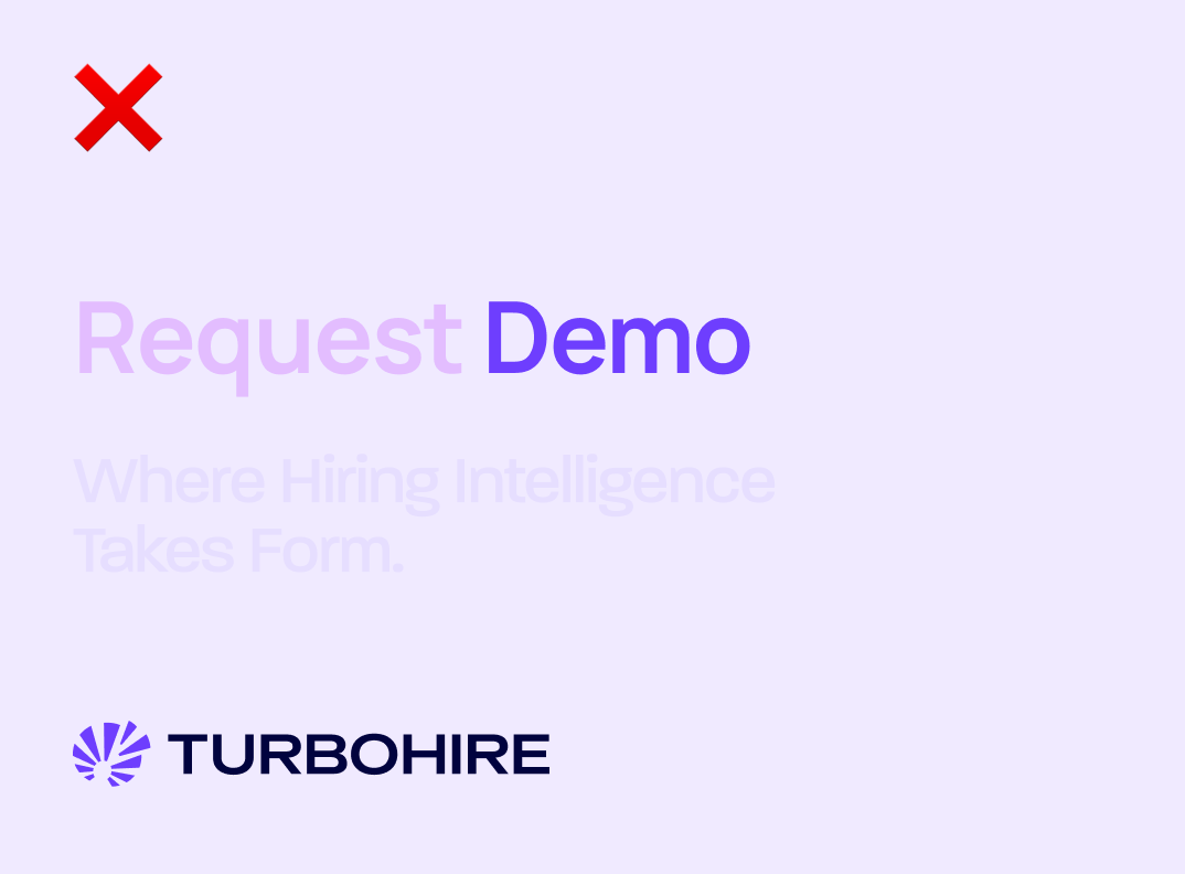
Logo Misuse: DON’Ts
Some of the examples of most likely misuses of identity are shown below. It’s imperative that the brand identity is consistent across all touchpoints at all times. To avoid these, always use the provided identity from here without any modification.
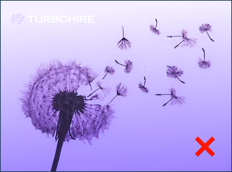
Do not keep a low contrast between the image and thecolor of the logo.
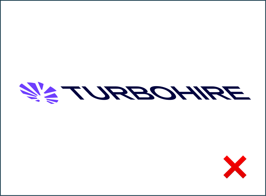
Do not stretch, squeeze, rotate or distort any part of the logo.Always scale uniformly.
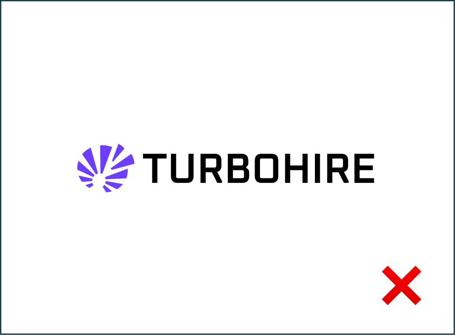
Do not change the typeface within the wordmark.
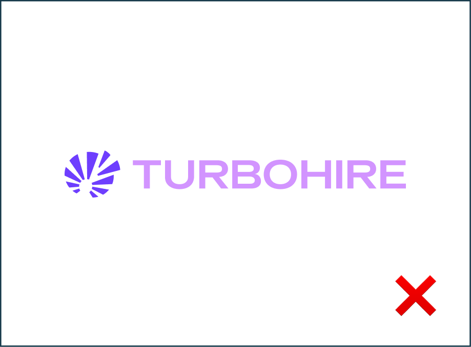
Do not change the colors of the logo randomly
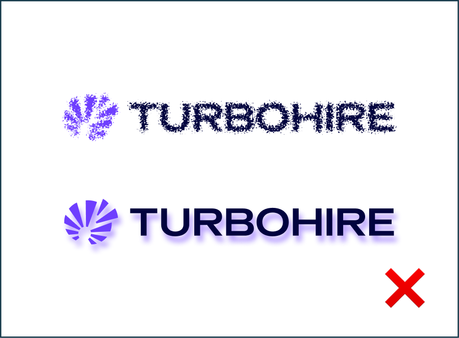
Do not add any effects to the logo.
Text Usage: DOs
Always follow the right pairing of fonts and sizes, to be mindful of legibility
Use only light coloured backgrounds for applications that are text heavy
Text Usage: DON’Ts
Do not overlap text with the exclusion zone of logo. Do not use darker backgrounds with text heavy applications.
Prioritize colour contrast of the text based on the importance it has on the application. Do not use too many text colours on the same application.