.svg)


A World of Possibilities | become manifesto
2:15
.png)
India’s Best Graphic Design Studio 2024
India’s Best Graphic Design Studio 2022
India’s Best Design Project Studio 2022
India’s Best Design Studio 2021
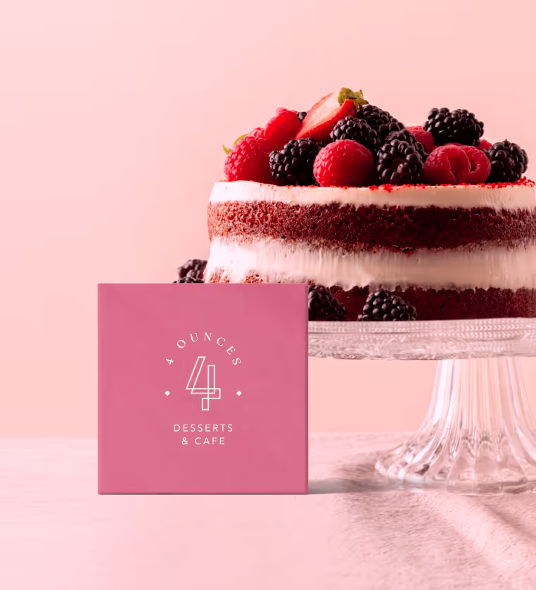
4 Ounces
Reimagining 4 Ounces: A Journey of Wit, Taste and Authenticity.
Access detailed case study
Get in touch with us to know more about the research, process, and output that relates to this project.
Oops! Something went wrong while submitting the form.

The team was always ready to get into back to back calls and was always ready to make changes as per the feedbacks and there was no hesitations in iterations. In other cases, people would tell me to go back to agreement. Your team is professional and did not act lazy. I appreciate that attitude. Initially, the branding process and terminology like archetype mapping seemed confusing but now I understand the importance of each step. I really liked the way you speak or draft your messages. You guys were on top of things at every point of time, which was great.
Nikhila Reddy
Founder, 4 Ounces Cafe
Founder, 4 Ounces Cafe
Services
Brand Identity Packaging Design Menu Design
Sector
Restaurant
Company Stage
Early stage
Timeline
2 months
Year
2024
Project Type
Re-Branding
About 4 Ounces
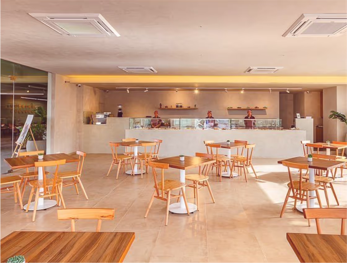
4 Ounces is a unique café and dessert brand located in the heart of Hyderabad, India. A brand that is passionate about crafting a community space that celebrates diversity, creativity, and flavour. Its serene and inviting atmosphere is designed to be a vibrant and safe haven for all kinds of conversations along with the goodness of their food.
4 Ounces is situated inside a bustling sports complex. The surrounding area is a vibrant hub, home to MBA institutions, college students, and IT organisations. This dynamic environment brings together sports enthusiasts, students, and professionals, creating a unique blend of potential customers.
4 Ounces is situated inside a bustling sports complex. The surrounding area is a vibrant hub, home to MBA institutions, college students, and IT organisations. This dynamic environment brings together sports enthusiasts, students, and professionals, creating a unique blend of potential customers.

Objectives & Challenges
We worked with Nikhila Reddy, founder of 4 Ounces to help with rebranding the visual identity and packaging design to make the brand look consistent and memorable.
Our aim was to enhance brand visibility by creating attractive signages to invite nearby IT park crowds, despite the location constraints of being inside a sports academy. Additionally, We planned to develop a cohesive brand identity by translating it into packaging, menu design, and other digital and print applications. Lastly, our objective was to establish a distinct brand identity to set 4 Ounces apart from competitors, boosting overall awareness.
Here are some of the challenges that we encountered during our creative process:
Packaging Cost Efficiency
We needed to reduce packaging costs while ensuring strong brand memorability, particularly for online orders to maintain profit margins without compromising the brand's appeal.
Constraints on Colour Palette
The client preferred to avoid primary hues of green, blue, and yellow, as well as pastel colors, to differentiate from competitors. This required us to select a unique colour palette that stood out and aligned with the brand’s identity.
Establishing Brand Name Consistency
Previously, the brand used multiple logo variations such as"4 Oz," "Four Ounces," and "4 Ounces," leading to confusion. Our task was to evaluate and recommend the most effective brand name in terms of visibility, recall, and recognition. After careful consideration, we unified the brand identity under the name "4 Ounces" to enhance cohesion and consistency across all platforms.


Visual Identity
The logo for "4 Ounces" features a stylised '4' designed as a closed circuit or loop, symbolising the continuous and ever-evolving process of food experiences and creations. The combination mark logo of 4 Ounces is presented in an elegant serif typeface. The overall design embodies sophistication and timelessness, reflecting the brand's commitment to creating unique and memorable culinary experiences.


When it comes to 4 ounces, each ingredient, each ingredient, each recipe, each meal, each individual are part of a larger narrative: a story of exploration, connection, and creation. Every piece, no matter how small adds to the beauty of the whole.


To improve 4 Ounces' visibility within a sports complex frequented by students and professionals, we designed elegant and consistent store signages. Distinctive colours were chosen to differentiate the brand, creating a cohesive and eye-catching presence that resonated with the diverse audience.


Designing the packaging for 4 Ounces, a cafe and restaurant, was a creative challenge due to budget constraints on packaging costs. To meet this, we adopted a single-colour packaging approach, emphasising clever and witty copy as the hero element. The design needed to be minimal yet memorable, steering clear of common pastel hues used by competitors. We chose a distinct pink and coffee colour palette to stand out. Our copywriting creatively connected food and mood, using playful phrases like "fooood," "gooood," “mooood”, "loooove," etc cleverly playing with “4” from the brand's name, "4 Ounces". The usage of 4 o’s was made to evoke a longer lasting good food experience.


Designing the menu for 4 Ounces was driven by a desire to enhance the customer experience based on valuable feedback. The client envisioned a flip-page menu, inspired by customers who enjoyed the tactile experience of flipping through pages. The menu was curated to showcase the cafe's specialty: authentic dishes from “4 corners of the world”.
To facilitate easy navigation, we divided the menu into categorical sections, making it intuitive for customers to find what they crave. We also included vibrant images of the dishes, allowing customers to visualise and familiarise themselves with the unique offerings before ordering. This approach not only informed but also tantalised, making the food look irresistibly mouth-watering and visually appealing.
To facilitate easy navigation, we divided the menu into categorical sections, making it intuitive for customers to find what they crave. We also included vibrant images of the dishes, allowing customers to visualise and familiarise themselves with the unique offerings before ordering. This approach not only informed but also tantalised, making the food look irresistibly mouth-watering and visually appealing.


Result
We aimed to elevate the brand's identity through cohesive and memorable design elements that resonate with the target audience. This new visual framework not only enhances the brand's overall appearance but also significantly elevates brand recall, making it memorable to the audience. The distinct visual style, combined with our strategic approach to visibility, color palette, and messaging, ensures that 4 Ounces stands out in the competitive market.
Project Team
We pride ourself on this in-depth exploration of various elements for this project. Our projects are created with precision and subtlety, and every design decision is made with an intent that generates value in its usage.
Aleesha J B
Associate Client Partner
IndhuKanth L
Creative Director
Pooja Shah
Associate Brand Strategist
Afridha Aneez
Junior Brand Strategist
.svg)


We’re going Carbon neutral by 2022

Announcing our journey to become Carbon neutral by the end of 2022.
What does this mean for you?
- We reduce CO2 on your behalf.
- Our process gets more efficient & refined.
- A refined efficient process saves cost.
Looking to go CO2 neutral? Let’s connect.

