.svg)


A World of Possibilities | become manifesto
2:15
.png)
India’s Best Graphic Design Studio 2024
India’s Best Graphic Design Studio 2022
India’s Best Design Project Studio 2022
India’s Best Design Studio 2021


Elevate Spenza's profile through impactful event experiences, positioning the brand prominently within the industry.
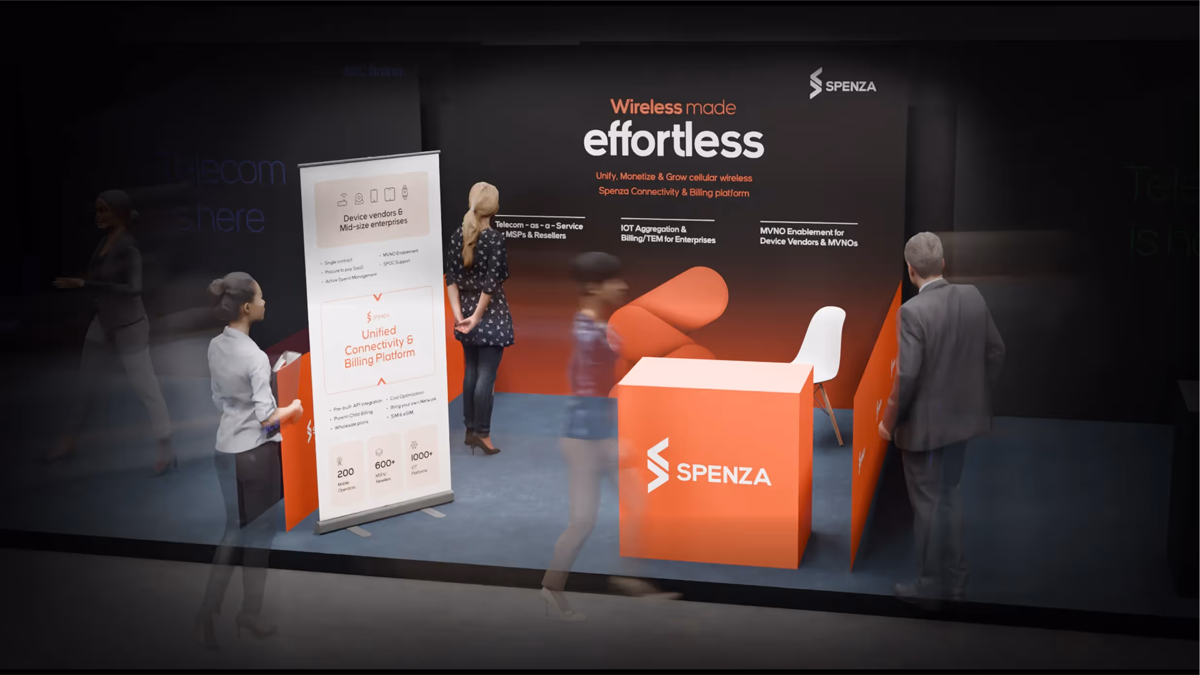
Develop a versatile and engaging mobile stall setup that can adapt to various events and venues, ensuring consistent brand presence.
Craft a cohesive and visually striking event experience, establishing a distinct and memorable look for Spenza's presence at events.


The Spenza event experience was meticulously designed to captivate and engage attendees. Beginning with a bold, impactful visual style, the design underscored Spenza’s innovative and user-friendly approach. The versatile mobile stall setup was crafted to seamlessly adapt to various events and venues, ensuring a consistent brand presence.

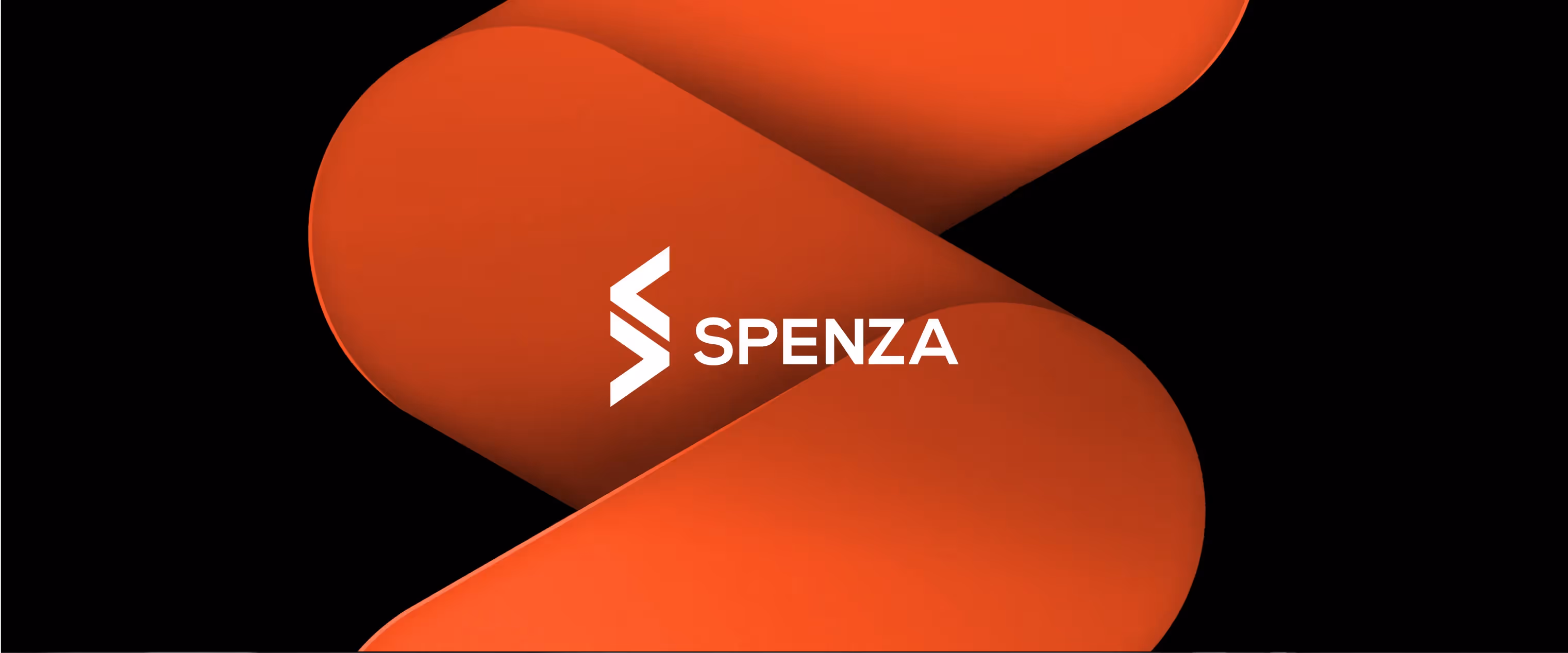
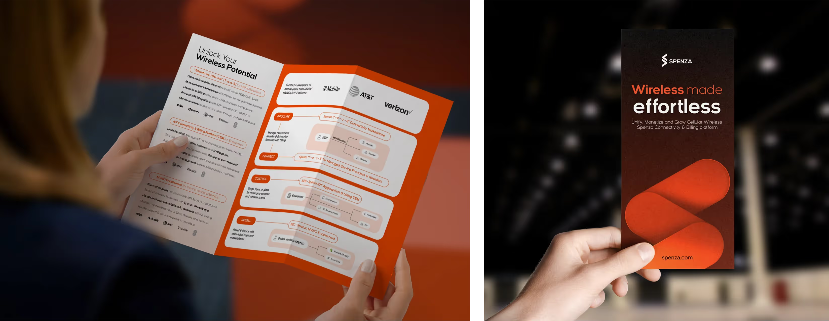
To position the firm as an innovative and user-friendly tech brand, we employed colors and visual elements to convey its innovative and approachable nature. Dark tones, symbolizing boundless space, underscore Spenza's position at the forefront of telecom technology. The brand's bright and bold orange conveys a modern, fresh image. The visually stylized 'S', with its simple, curved edges and bright hue, enhances the approachable tone. White and lighter tones were utilized to ensure legibility and ease of content consumption.
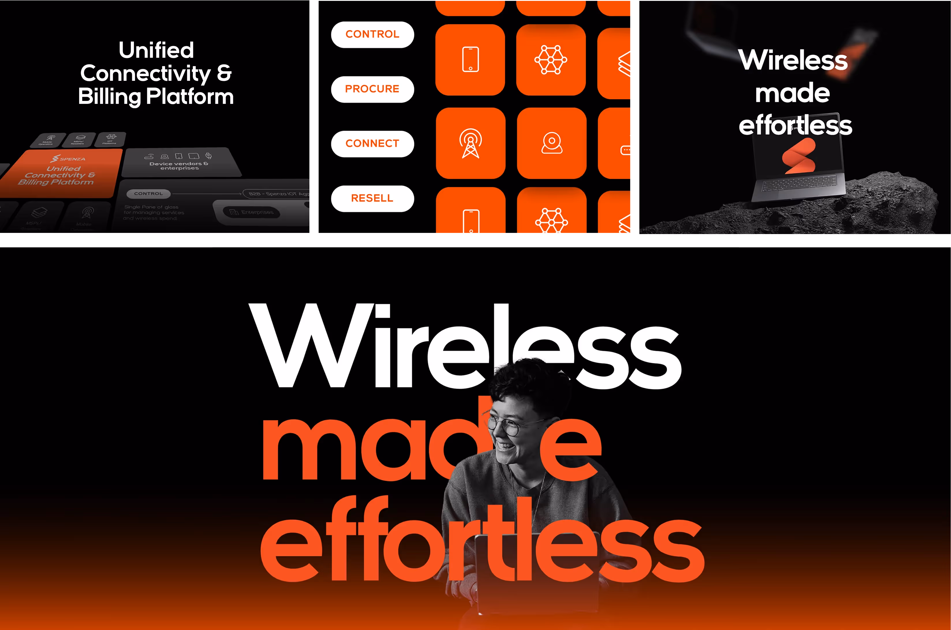
We crafted a message highlighting Spenza's ease of use and effortlessness, positioning it as the enabler for users to access the vast world of telecom and wireless. This concept was encapsulated in the impactful tagline, "Wireless made effortless."
.gif)
Our task was to perfect Spenza's first impression, testing multiple iterations for maximum impact. We designed the setup to suit various venues and conditions, ensuring versatility and adaptability. The final design captivated and engaged, resonating with audiences while maintaining a consistent brand presence.
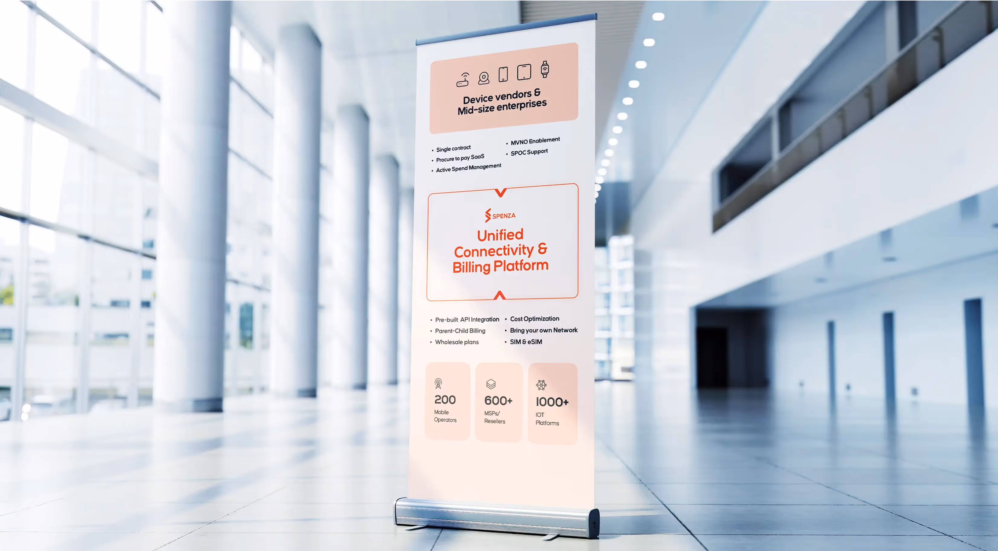
The pull-up banner is designed to quickly and clearly convey the essence of Spenza. By distilling the complexities of the ‘Unified Connectivity & Billing Platform,’ it presents the platform's functionality in an accessible and straightforward manner. This approach ensures that attendees can quickly grasp Spenza's offerings, benefits, and capabilities at a glance, facilitating a better understanding and engagement with the brand.
.avif)
We transformed the wireframes by honing in on key information and optimizing the layout for clarity and impact. Our efforts were geared towards showcasing Spenza's diverse services and unique advantages in a way that maximized their visibility. By carefully designing each element, we ensured that the presentation was not only visually appealing but also effectively communicated the core benefits of Spenza's offerings, driving home the value proposition to the audience.
.gif)
Generated 40+ leads from the first event, with more expected. The tagline seamlessly integrated with the overall brand and has become an integral component. Simplified visual representation of the business and offerings is now enhancing the Spenza team's sales efforts. Visual elements are being incorporated into other marketing materials and documents. Developed a mobile stall setup adaptable for future events and various use cases.


.svg)


